
2027 Colours of the Year: What the Paint Brands Chose, and How to Use Them
Every fall, major paint companies reveal their Colours of the Year, offering a glimpse into the interior design trends that will shape our homes in the year ahead. And if the 2027 paint colour predictions tell us anything, it's that warmth, nature, and personality are taking centre stage.
From earthy olive greens and sunbaked terracotta to soft, nostalgic pinks and muted blues, this year's colour selections aim to create spaces that feel comfortable, inviting, and deeply personal. We're seeing a continued shift away from cool greys and stark whites toward warmer, more expressive palettes inspired by the natural world.
But a Colour of the Year isn't a rule. Think of it as inspiration. The best paint colour for your home is one that complements your space, reflects your personal style, and makes you feel good every time you walk into the room.
We've rounded up the 2027 Colours of the Year from eight major paint brands available in Canada, along with our interior design perspective on what makes each shade special and how we'd incorporate it into a real home.
Benjamin Moore: Webster Green HC-130
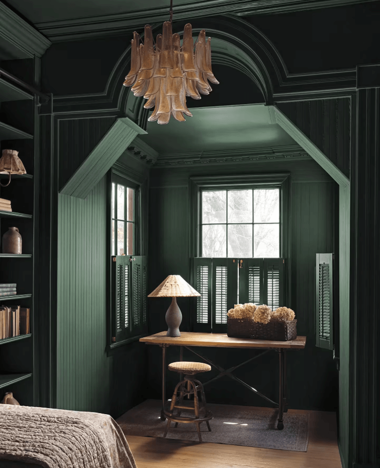
Benjamin Moore's 2027 Colour of the Year, Webster Green HC-130, is a rich, balanced green that sits beautifully between emerald and evergreen. It's a timeless shade that feels both fresh and familiar, bringing colour into a space without overwhelming it.
What we particularly love about Webster Green is its versatility. It feels equally at home in a traditional interior filled with character as it does in a more contemporary setting. There's a certain sophistication to it, but it still feels welcoming and easy to live with.
How we'd use it: We love the idea of Webster Green on lower kitchen cabinets, a library or dining room walls, where depth reads as cozy rather than dark. Pair it with warm wood tones, aged brass, natural textures, and creamy whites to create a beautifully layered space. For something a little more unexpected, consider pairing it with Benjamin Moore's complementary shades like 228 Shakespeare Tan, HC-64 Townsend Harbour Brown, and 1169 Antique Copper.
Sherwin-Williams: Celery SW 6421
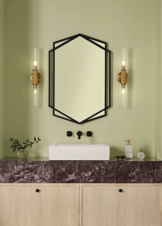
Sherwin-Williams’ 2027 Colour of the Year, Celery SW 6421, is a soft, airy green with subtle yellow undertones, sitting between a pastel and a herbal tone. Sherwin-Williams describes it as "a quiet reset for the home." It's a refreshing yet comforting shade that brings a subtle connection to nature indoors.
How we'd use it: In bedrooms, bathrooms and reading nooks where you want to create a calm, inviting atmosphere. It would also look beautiful on a ceiling for an unexpected pop of colour. Pair it with natural linen, light oak, and woven textures for a warm, relaxed feel. Sherwin-Williams suggests White Flour SW 7102, Woven Wicker SW 9104, and Plum Brown SW 6272 for a little contrast.
ADC Principal Ariane recently painted her guest bedroom a very similar shade of green, and she absolutely loves how it turned out. It strikes the perfect balance between not too light and not too dark, creating a space that feels cozy without feeling heavy. Even her guests have commented on how much they love the colour. It's a shade we'd happily recommend for anyone looking to bring a little warmth and tranquillity into their home.
Behr: Grounded T27-01
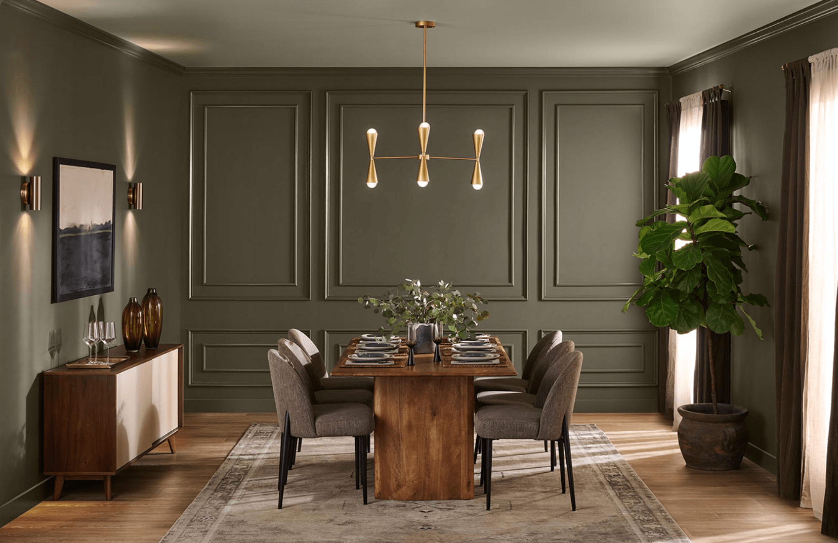
Behr's 2027 Colour of the Year, Grounded T27-01, is an earthy olive green that moves between olive and moss, with subtle brown undertones. Inspired by nature, this warm, organic shade brings a sense of calm and comfort into the home.
What makes Grounded particularly appealing is its richness without feeling overly bold. Unlike cooler greens, its earthy undertones give it a lived-in quality that feels both sophisticated and approachable. It's a versatile choice for anyone looking to introduce colour while maintaining a timeless interior design aesthetic.
How we'd use it: This earthy olive green works well in dining rooms, entryways, or on kitchen cabinetry, especially when paired with terracotta, natural stone, and warm wood tones. For a more immersive feel, consider colour drenching by painting the walls and trim the same shade to create a cozy, enveloping atmosphere. Layer in walnut, cognac leather, and textured finishes to add depth and character for a space that feels warm, inviting, and effortlessly sophisticated.
SICO: Glazed Earth 6066-84
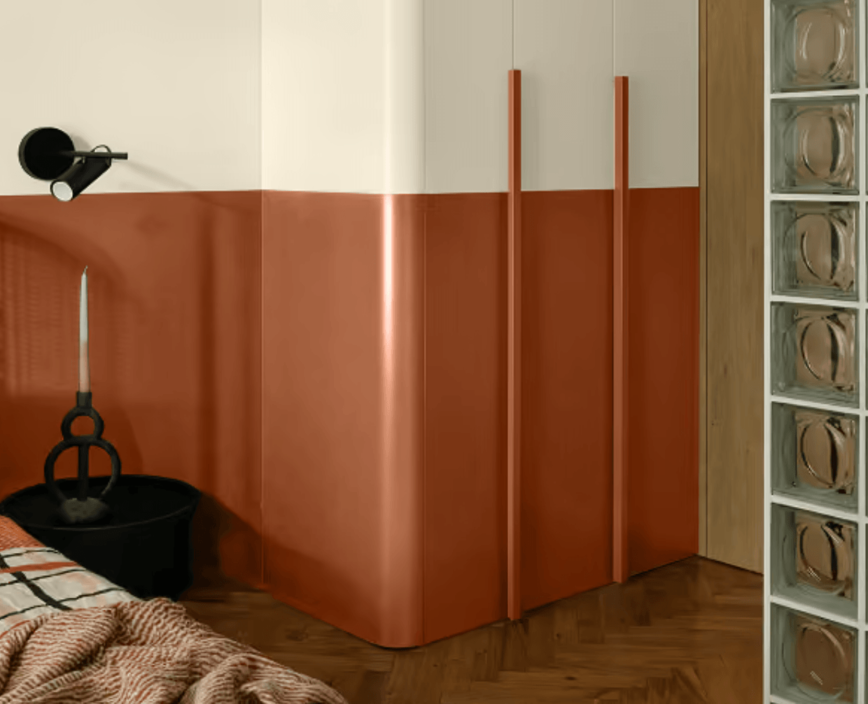
SICO's 2027 Colour of the Year, Glazed Earth 6066-84, is a rich terracotta brown with warm, reddish undertones. Inspired by sunbaked clay and natural materials, this earthy paint colour brings a sense of warmth and character to interiors. It's a beautiful example of the growing appreciation for colours that feel organic, comforting, and connected to nature.
What we love about Glazed Earth is its ability to make a space feel instantly welcoming. There's a rustic quality to it, but when paired with the right materials and furnishings, it can feel sophisticated and contemporary.
How we'd use it: Glazed Earth would make a beautiful statement in a dining room, hallway, or a ceiling detail. We'd pair this warm terracotta with creamy whites, natural oak, travertine, and textured linen to create a relaxed, Mediterranean-inspired interior. For a more dramatic look, add dark walnut furniture, sculptural lighting, and subtle burgundy accents to add richness and depth.
Valspar: Cottage Door V138-4
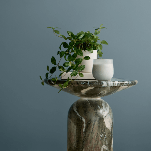
Breaking away from the greens dominating this year's selections, Valspar's 2027 Colour of the Year, Cottage Door V138-4, is a soft, muted blue with subtle grey undertones. Balancing warmth and coolness, this powdery blue feels both calming and inviting. Valspar describes it as a colourful new neutral, offering a refreshing alternative to traditional whites, greys, and beiges.
What we love about Cottage Door is its understated charm. It has a slightly nostalgic quality that feels timeless rather than trendy, making it equally suited to traditional and contemporary interiors. It's a great option for homeowners who want to introduce colour without creating an overly bold statement.
How we'd use it: Cottage Door would look beautiful in a home office, bedroom, pantry, or mudroom, especially as a whole-room paint colour. Consider colour drenching the walls, trim, and doors for a cohesive, enveloping look, or introducing this muted blue through cabinetry for a more subtle approach. Pair it with warm off-whites, natural wood tones, soft blush pinks, and deep plum accents to create a space that feels layered, welcoming, and full of character.
Dulux Canada: Birthday Cake DLX1059-2
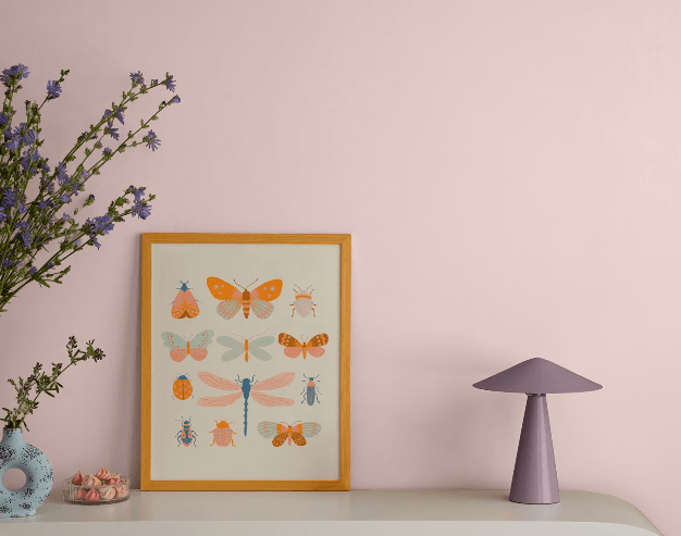
Dulux Canada's 2027 Colour of the Year, Birthday Cake DLX1059-2, is a soft, dusty blush pink with subtle grey-brown undertones. Warm, delicate, and slightly nostalgic, this muted pink offers a refreshing alternative to traditional neutrals. Its understated warmth feels sophisticated rather than overly sweet, bringing a gentle sense of comfort and personality into the home.
How we'd use it: Birthday Cake would be a lovely choice for a cozy bedroom or a playful, feminine powder room. Its soft blush tones pair beautifully with creamy whites, natural oak, warm brass, and rich burgundy accents. For a more sophisticated look, introduce darker wood furniture and textured fabrics to balance the sweetness of the pink and create a space that feels inviting and full of character.
Cloverdale Paint: Calliope 0044
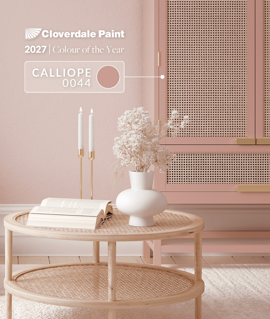
BC-based Cloverdale Paint has selected Calliope 0044 as its 2027 Colour of the Year. Inspired by the delicate beauty of the calliope hummingbird, this muted, dusty pink has a subtle mineral quality that gives it depth and warmth. Unlike traditional pastel pinks, Calliope feels more grounded and mature, offering a sophisticated way to introduce colour into a home.
There's something particularly charming about this shade. It feels nostalgic without being old-fashioned, and its earthy undertones make it surprisingly easy to pair with natural materials and richer accent colours.
How we'd use it: We'd love to see this colour in a bedroom, dressing room, or an entryway. Pair it with dark wood furniture, warm brass, natural stone, and creamy neutrals for a refined, timeless feel. For something a little more unexpected, introduce deep burgundy, olive green, or navy blue accents to create contrast and give this dusty pink a more contemporary edge.
BeautiTone: Rosewater TR27-2-1
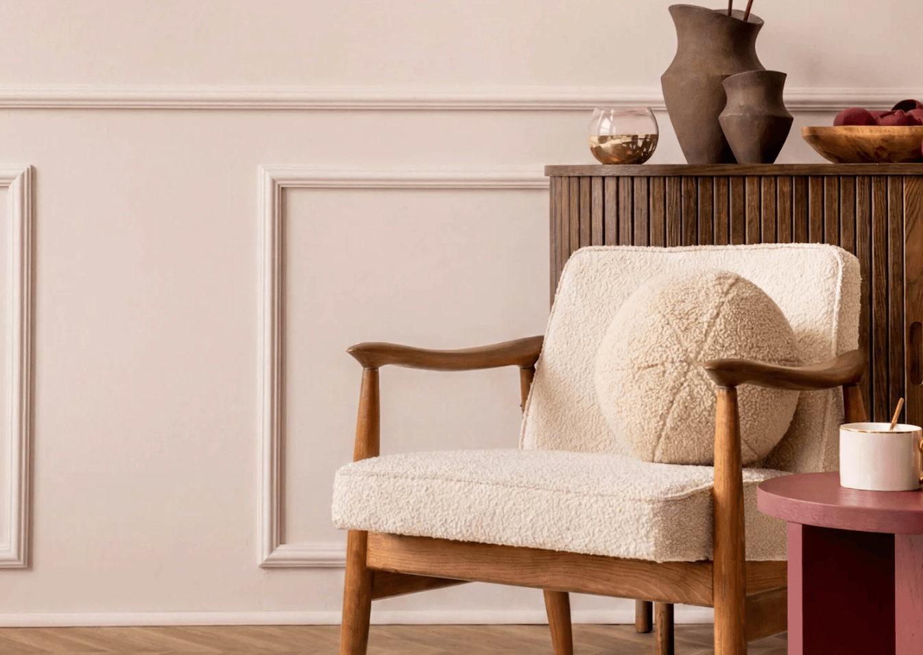
BeautiTone's 2027 Colour of the Year, Rosewater TR27-2-1, is a delicate, pale pink with subtle yellow undertones that give it a soft, warm glow. Part of the brand's Echoes of Earth colour palette, Rosewater reflects a move toward lighter, more comforting interior paint colours that feel welcoming without being overly sweet.
What makes Rosewater interesting is how close it sits to a warm neutral. It's gentle enough to serve as a subtle backdrop while still introducing a hint of personality. For homeowners drawn to warmer interiors but looking for something beyond traditional beige, it's a lovely alternative.
How we'd use it: Rosewater would be beautiful in a nursery, an office, or even a bathroom where its warm undertones can create a flattering, inviting atmosphere. We'd pair it with natural oak, ivory textiles, soft sage green, and warm brass accents. For a more contemporary feel, introduce clean-lined furniture and a few darker details to balance the softness of the pink.
What the 2027 colours have in common
Looking at the 2027 paint colour trends, one thing is clear: we're embracing warmth, nature, and a little more personality in our homes.
From the earthy greens of Webster Green and Grounded to the sunbaked terracotta of Glazed Earth, this year's selections lean heavily into colours inspired by the natural world. Even the softer shades, like Cottage Door, Birthday Cake, and Rosewater, share a sense of comfort and nostalgia.
What's particularly interesting is the shift away from cool greys and stark whites toward warmer, more expressive interior colour palettes. These aren't necessarily bold statement colours, but rather shades that can serve as beautiful backdrops for everyday living.
For us, the takeaway is that colour is becoming a neutral again. Whether it's a muted green, a dusty pink, or an earthy terracotta, these shades can feel just as timeless and versatile as traditional neutrals when paired thoughtfully with natural materials like wood, stone, linen, and clay.
How to bring a colour of the year into your home
You don't need to repaint your entire home to embrace the latest interior paint colour trends. Sometimes, a small, thoughtful change can make the biggest impact.
Start with one room or surface. An interior door, bathroom vanity, ceiling, or built-in shelving can be a beautiful way to introduce a new paint colour without committing to an entire room.
Sample colour in your own lighting. Paint large swatches on at least two walls and observe how they change throughout the day. Natural light, artificial lighting, and surrounding finishes can all influence how a colour appears in your home.
Pay attention to undertones. Not all greens, pinks, or blues are created equal. Earthy olive greens like Behr's Grounded pair beautifully with warm woods and creamy whites, while softer greens like Sherwin-Williams' Celery can complement lighter oak and natural linens. Understanding undertones is key to creating a cohesive interior colour palette.
Explore colour beyond paint. Upholstery, artwork, tile, and textiles are great ways to introduce trending colours into your home without picking up a paintbrush. They're also easier to update as your style evolves.
Build a palette, not a single colour. Rather than designing around one trendy shade, consider how it works with your existing finishes, furnishings, and architectural details. Pair your chosen colour with complementary neutrals, varied textures, and a few carefully selected accents for a space that feels intentional and timeless.
Ultimately, the best paint colour isn't necessarily the one making headlines. It's the one that complements your home, reflects your personality, and creates the atmosphere you want to live in.
Need some guidance choosing the right colour for your home? Our Hourly Design Package offers flexible, personalized interior design support tailored to your needs. Whether you're refreshing a single room, exploring new paint colours, or bringing together finishes and furnishings, we're here to help you create a home that feels cohesive, intentional, and uniquely yours. Available in the South Okanagan and virtually across Canada.