
2022 Paint ‘Colour of the Year’ Review
October 15, 2021
If you saw my Instagram post earlier this week, you might have guessed the subject of this month’s blog post...or maybe not? I am never quite sure how familiar everyone is with the paint brands’ ‘Color of the Year’, but if you recognized the paint in the post as Urbane Bronze, then congratulations to you and your sharp eye for colour - this was Sherwin-Williams’ trend prediction for 2021.
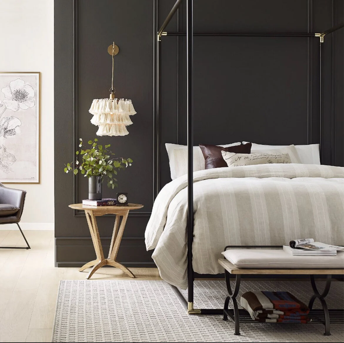
Credit: Courtesy of Sherwin-Williams, Urbane Bronze 7048
Nothing reminds me more that the year is drawing to a close, than the leaves falling, Christmas decorations appearing in stores, and of course, paint companies announcing their ‘Color of the year’. I recognize that this is the interior designer in me, but I still think it’s exciting, a new coat of paint is the epitome of a fresh start.
Paint companies have all recently announced their predictions for the trends of 2022. So, after checking them all out, I am pondering what this might mean for the year in interior design. As I discussed in a recent blog post, colour psychology has a huge effect on interior design, different colours evoke different emotions in people, so this is important business, they are quite literally setting the tone for the year.

Credit: Courtesy of Sherwin-Williams, Evergreen Fog 9130
Sherwin-Williams revealed their pick at the end of September, as Evergreen Fog SW 9130, a versatile calming hue. They describe the colour as a ‘gorgeous green-meets-gray, with just a bit of blue’ – a far cry from 2021’s moody and bold Urbane Bronze SW 7048 (I like them both, they are just very different).
As its name suggests Evergreen Fog has a base of green, which is known to have soothing and calming effects, and let’s face it, that’s probably something we all need more of in 2022.
Benjamin Moore announced their pick this week as October Mist CC-550 a ‘gently shaded sage’, which again, is a lot more muted than 2021’s selection, Aegean Teal 2136-40.
It seems this year that their consensus has been pastels or soft cooler hues. If we follow their lead, we’ll all be transported to our very own Hampton’s getaway in no time. Basically, I think the paint companies are hinting that we all need to relax.

Credit: Courtesy of Benjamin Moore, October Mist CC-550

Credit: Courtesy of Dulux, Bright Skies™

Credit: Courtesy of Behr, Breezeway MQ3-21
Credit: Courtesy of Glidden, Guacamole PPG1121-5
Credit: Courtesy of HGTV Home by Sherwin-Williams, Aleutian HGSW3355
Who’s pick do you prefer? Keep an eye out for our Instagram stories later today to have your say.
If you love one of the colours but aren’t sure what to pair it with, they all have tools to help you create a harmonious palette.
Sherwin-Williams lists ‘coordinating colours’ below each of their paint colours - here are the matches for Evergreen Fog. Benjamin Moore have shared their top thirteen picks for a coordinated colour palette for October Mist here.
You will be pleased to know that Sherwin-Williams aren’t expecting us to turn our backs on Urbane Bronze completely, it’s listed in their line up of coordinating hues for Evergreen Fog.

This nature-inspired palette of coordinating hues creates a modern, organic feel when paired with Evergreen Fog.
If you would prefer to hand over that kind of decision to a professional, Ariane Design Co. are here to help. Amongst our other services, we offer colour consultations, which is a service designed to analyze your home, and help you select a colour palette.
If you have already taken the plunge with one of the Sherwin-Williams, Benjamin Moore or Behr predictions we would love to see how it turned out. Tag us so we can take a look.
Ariane Xx